
This Is What RetroWhims Looks Like
Some things you have to show, not just say.
Last fall, I set out to do exactly that — to create a photoshoot that wasn’t inspired by a client’s vision or a venue’s aesthetic, but by my own. This is my design language. My color instincts. My way of seeing flowers as something more than decoration. This shoot is the visual answer to the question I’m often asked: what does RetroWhims actually look like?
And in 2026, these are the images I’m putting forward as that answer.
A Color Story Nobody Expected
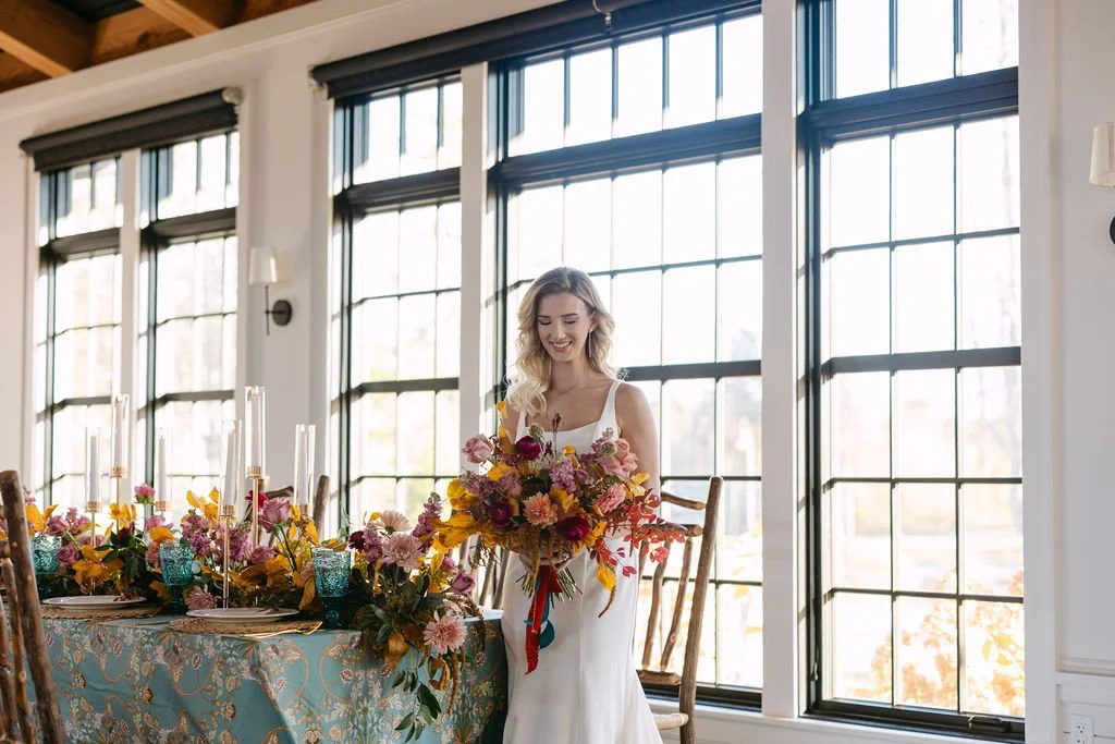
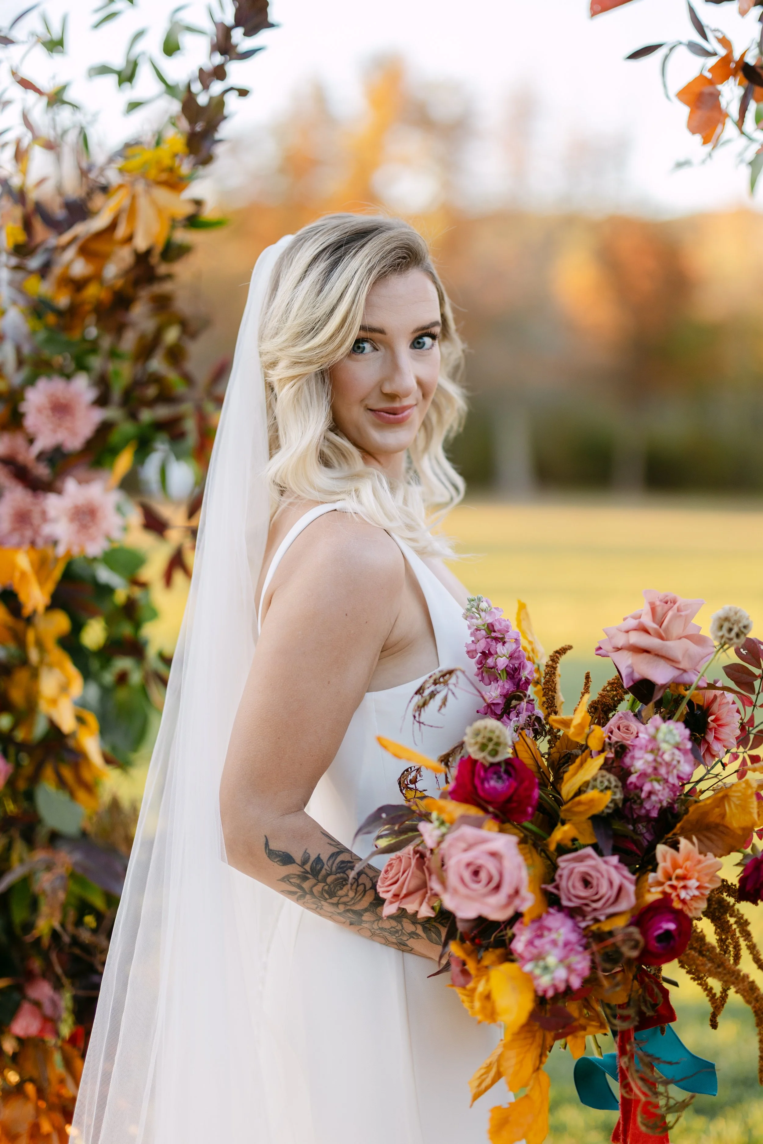
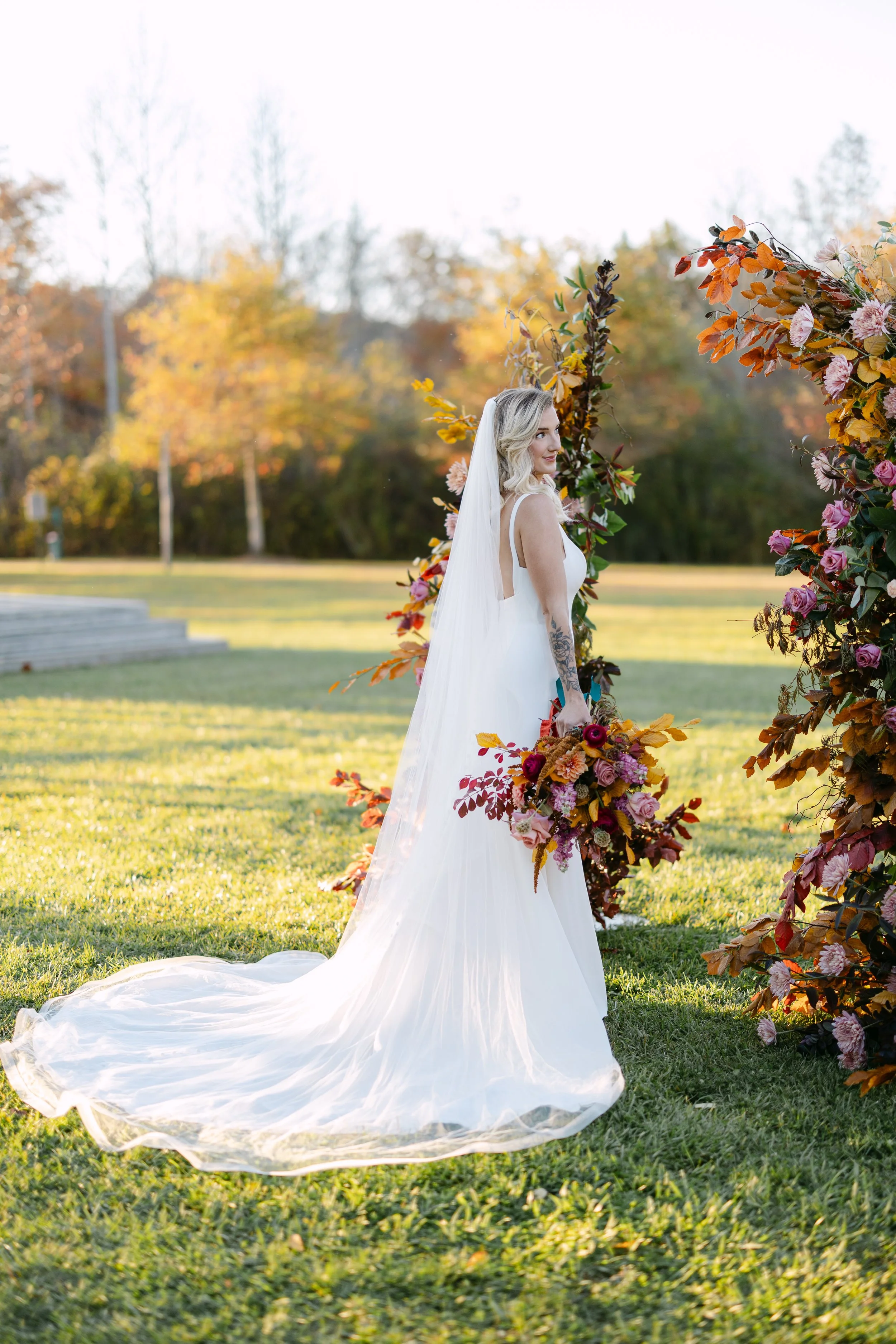
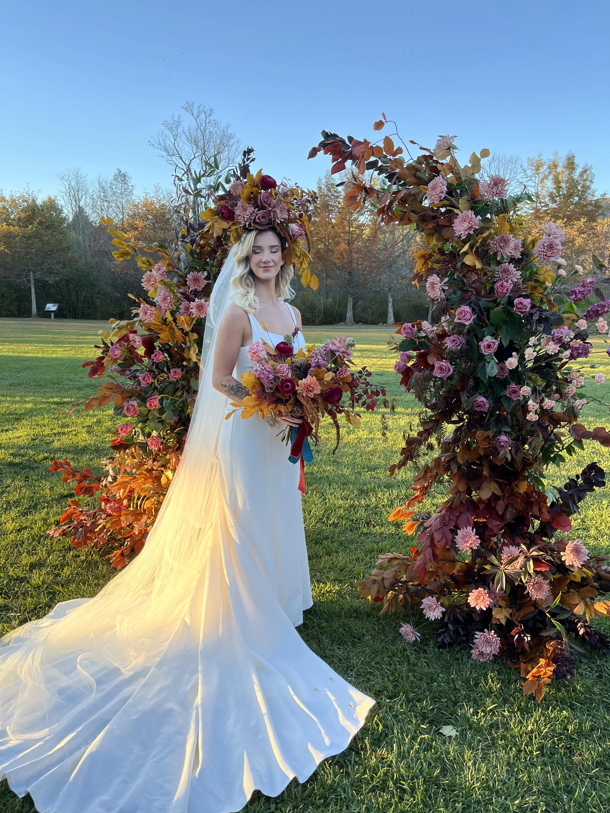
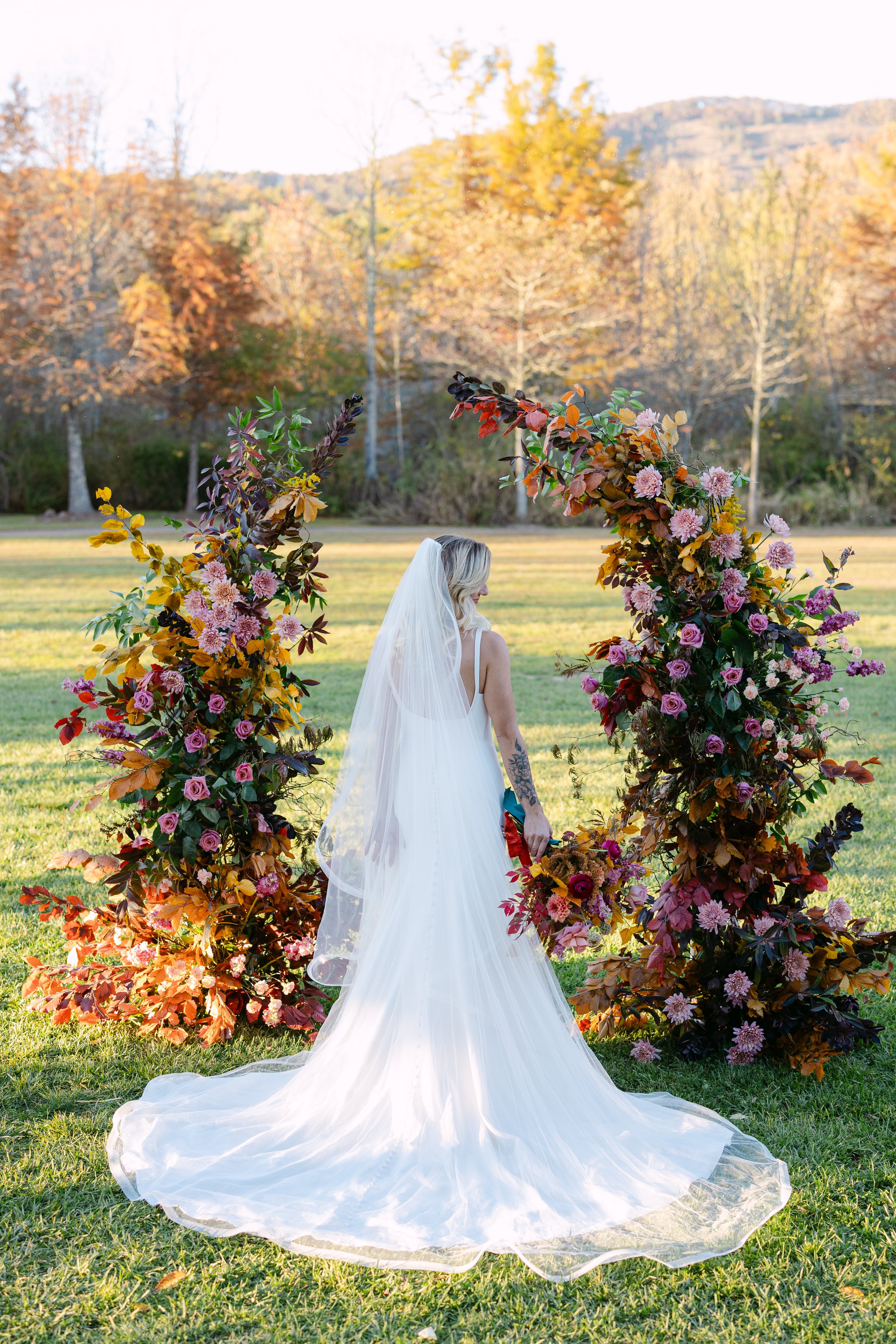
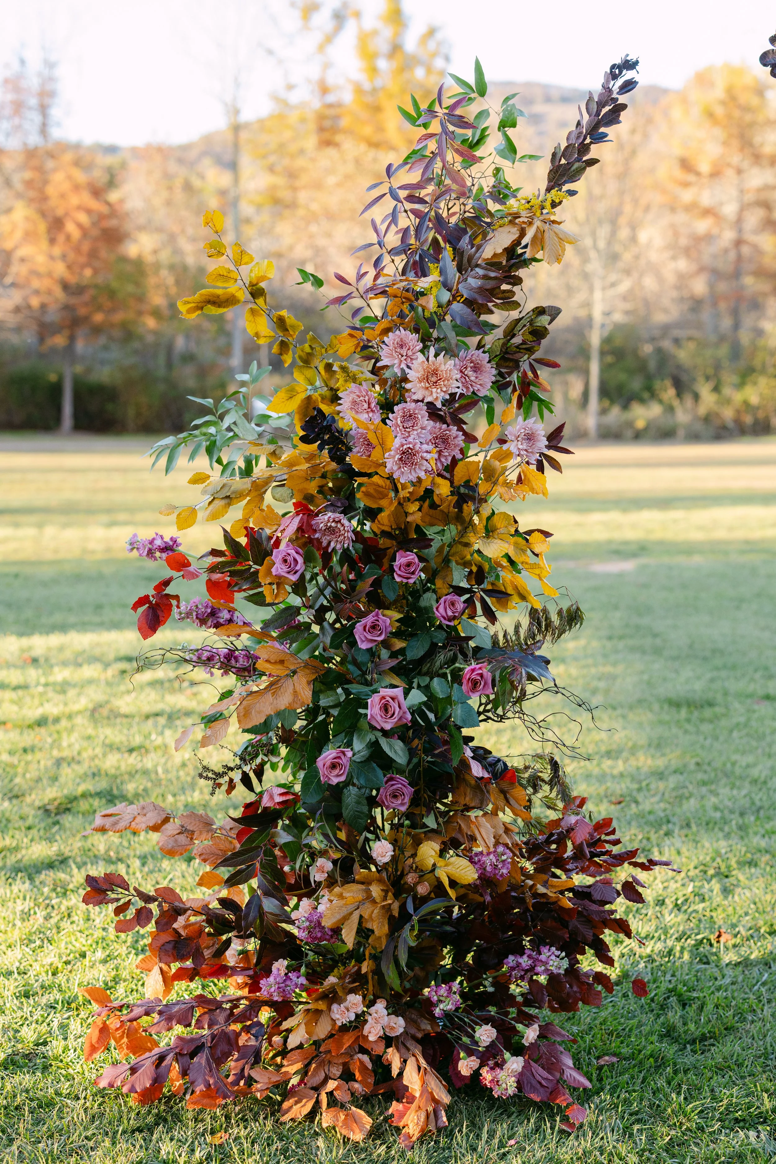
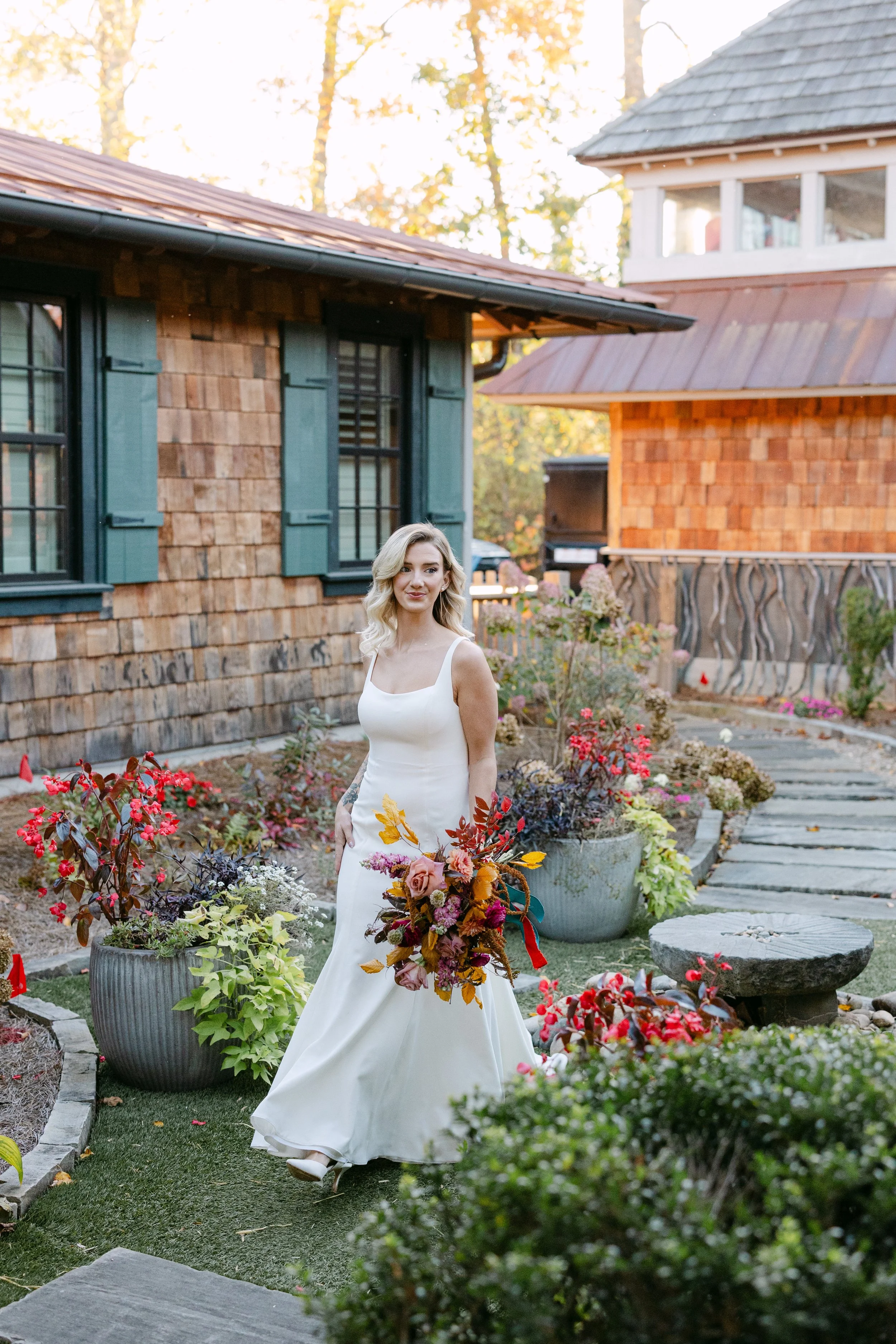
The palette for this shoot was built around a vintage lamp that I love, resulting in a color story that photographer, Darrell Cassell, told me he had never seen used in a wedding context before. That felt right.
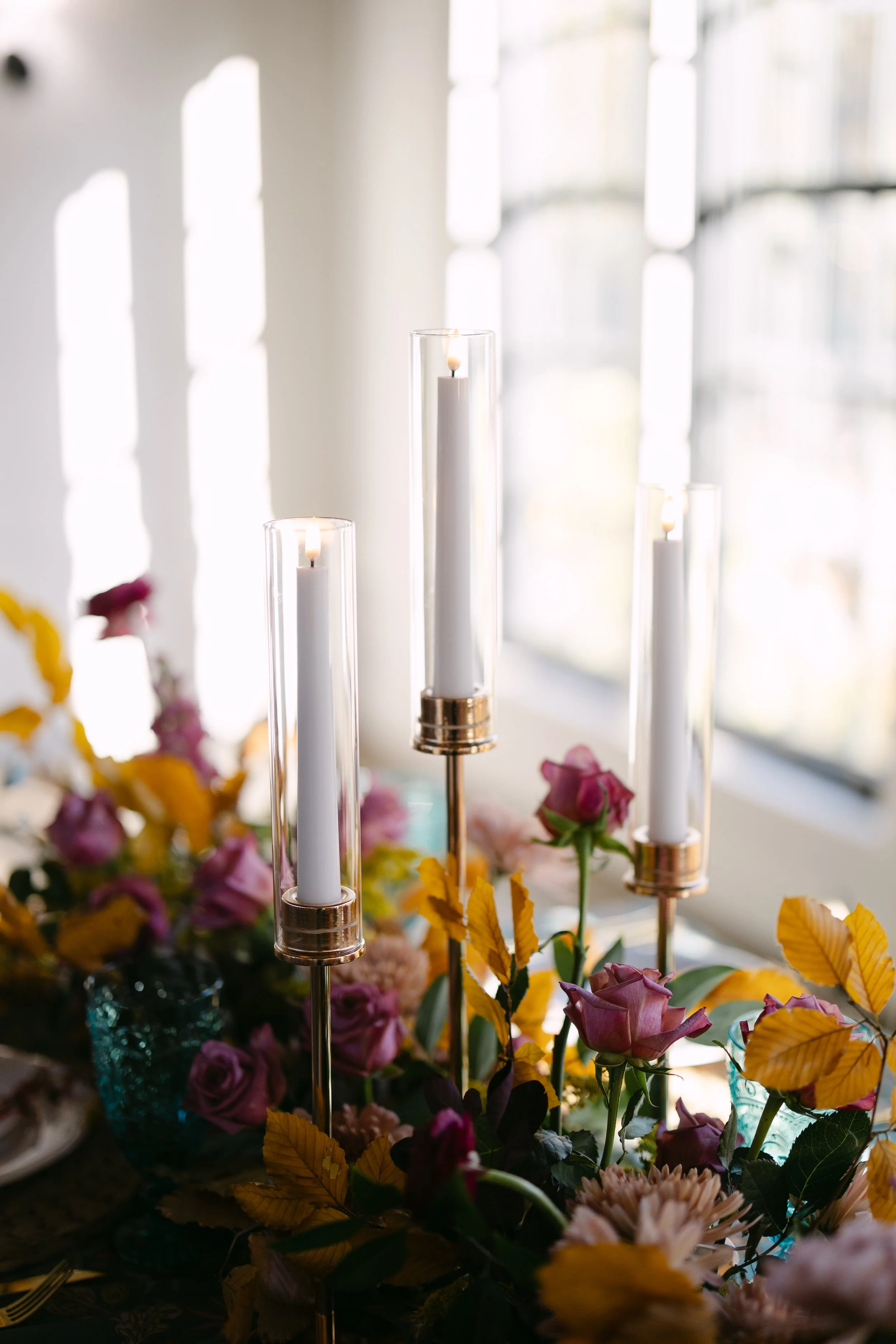
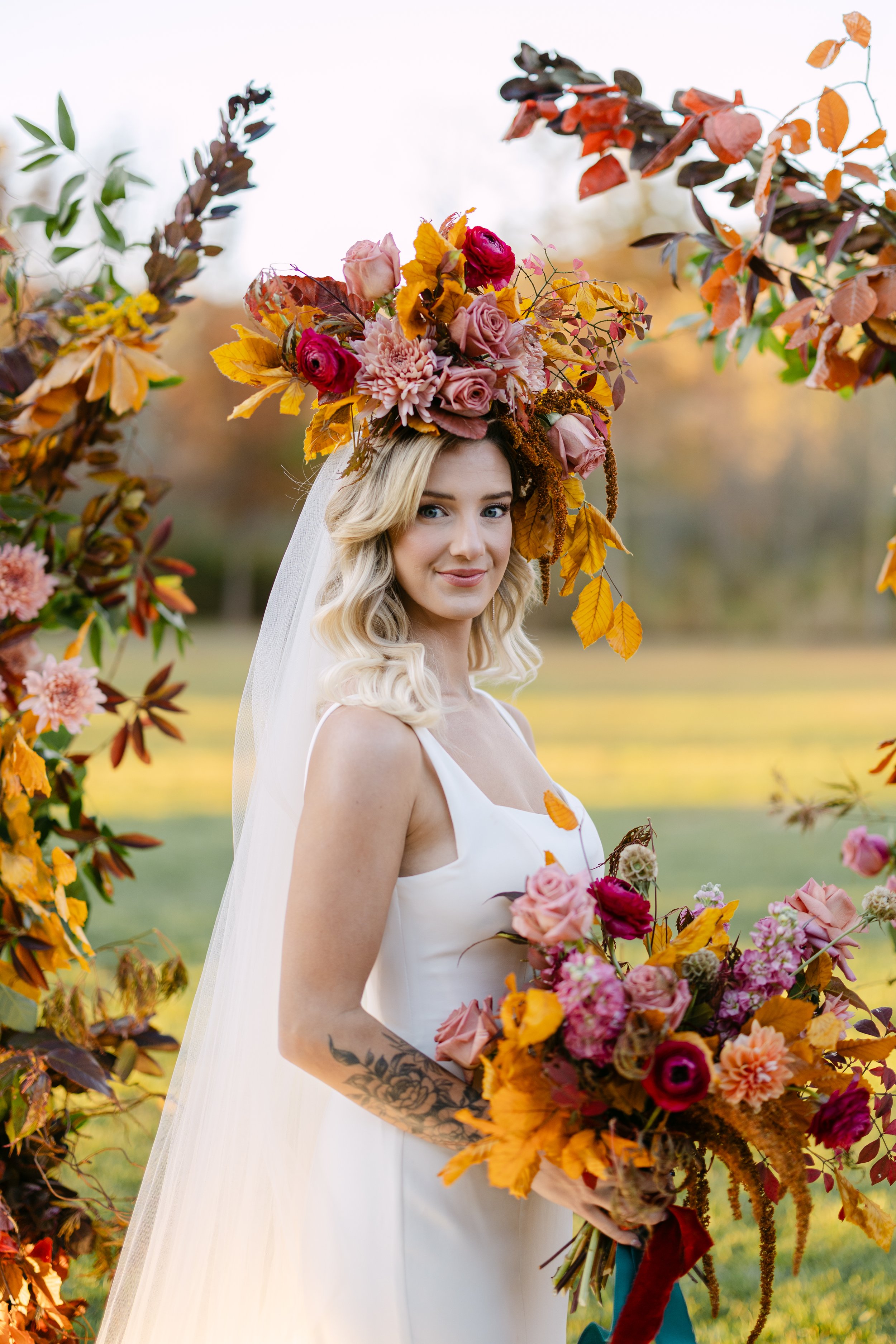
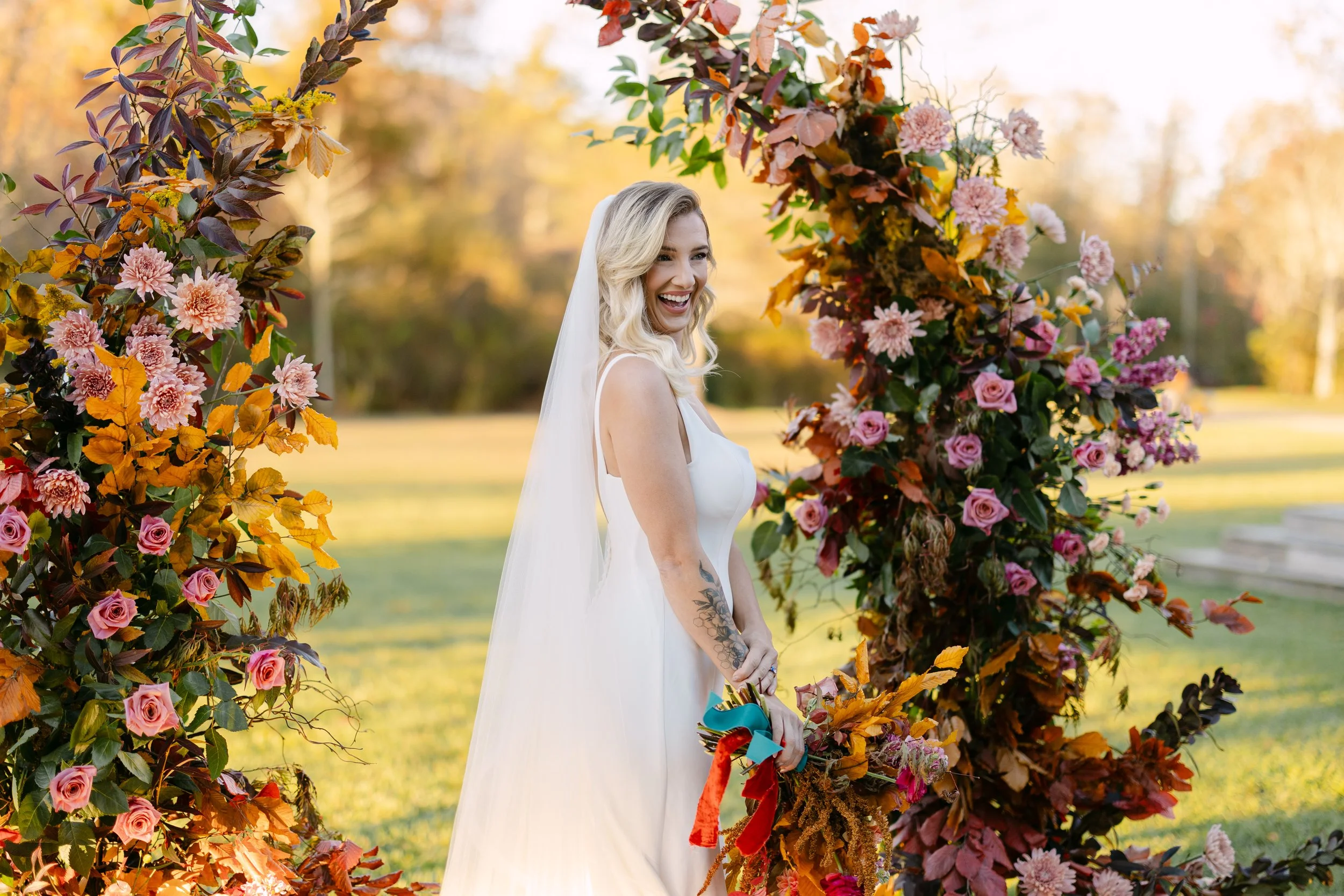
Deep teal anchored everything — rich, unexpected, and completely considered. Against it: warm brick reds, mauve, soft terracotta, antique gold, and the golden glow of preserved beech leaves catching the light. It is not a palette you stumble into. It is one you build, carefully, from an understanding of how colors push and pull against each other. Complementary tension. Warmth meeting cool. The kind of combination that stops you mid-step and makes you look twice.
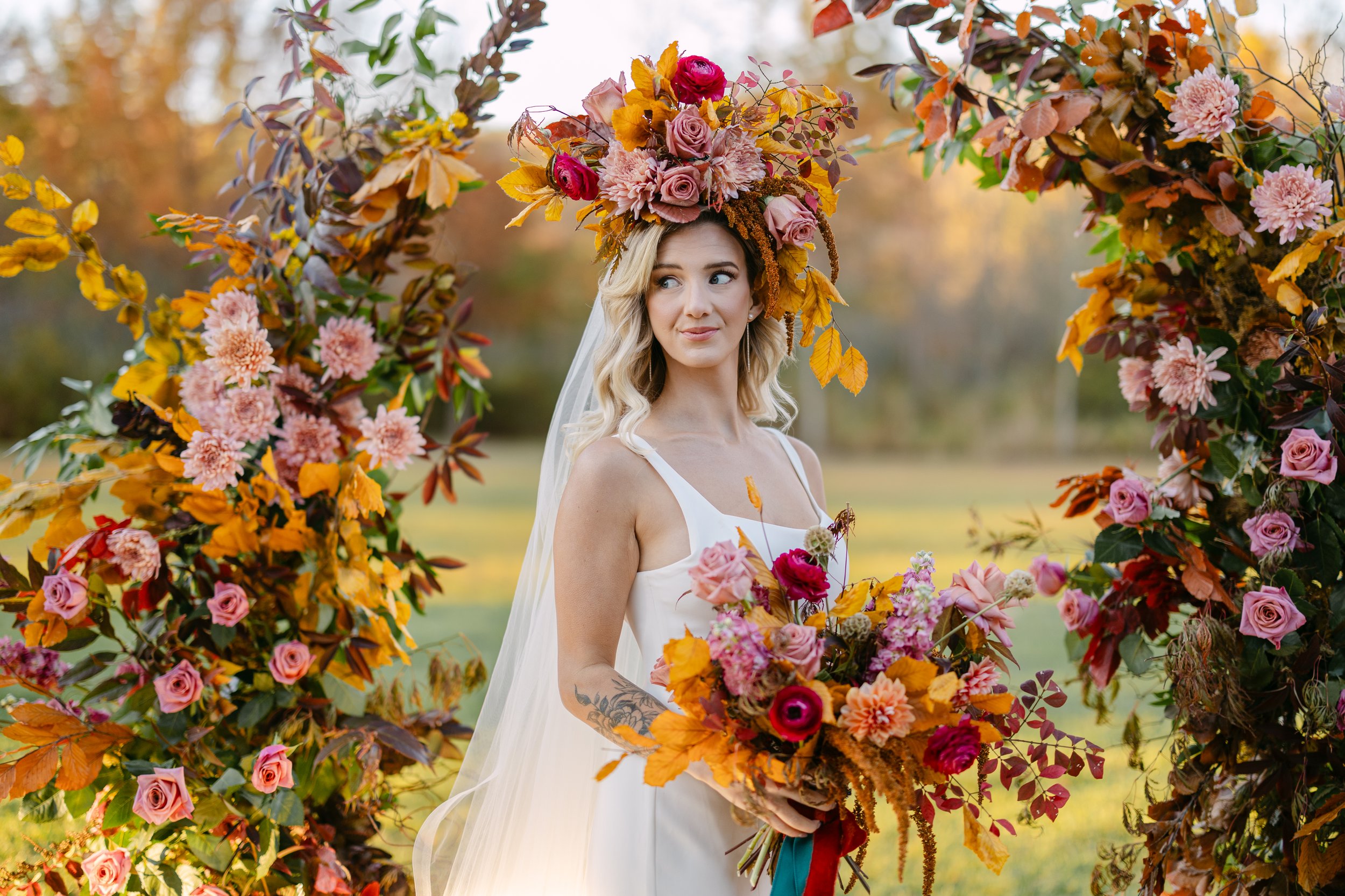
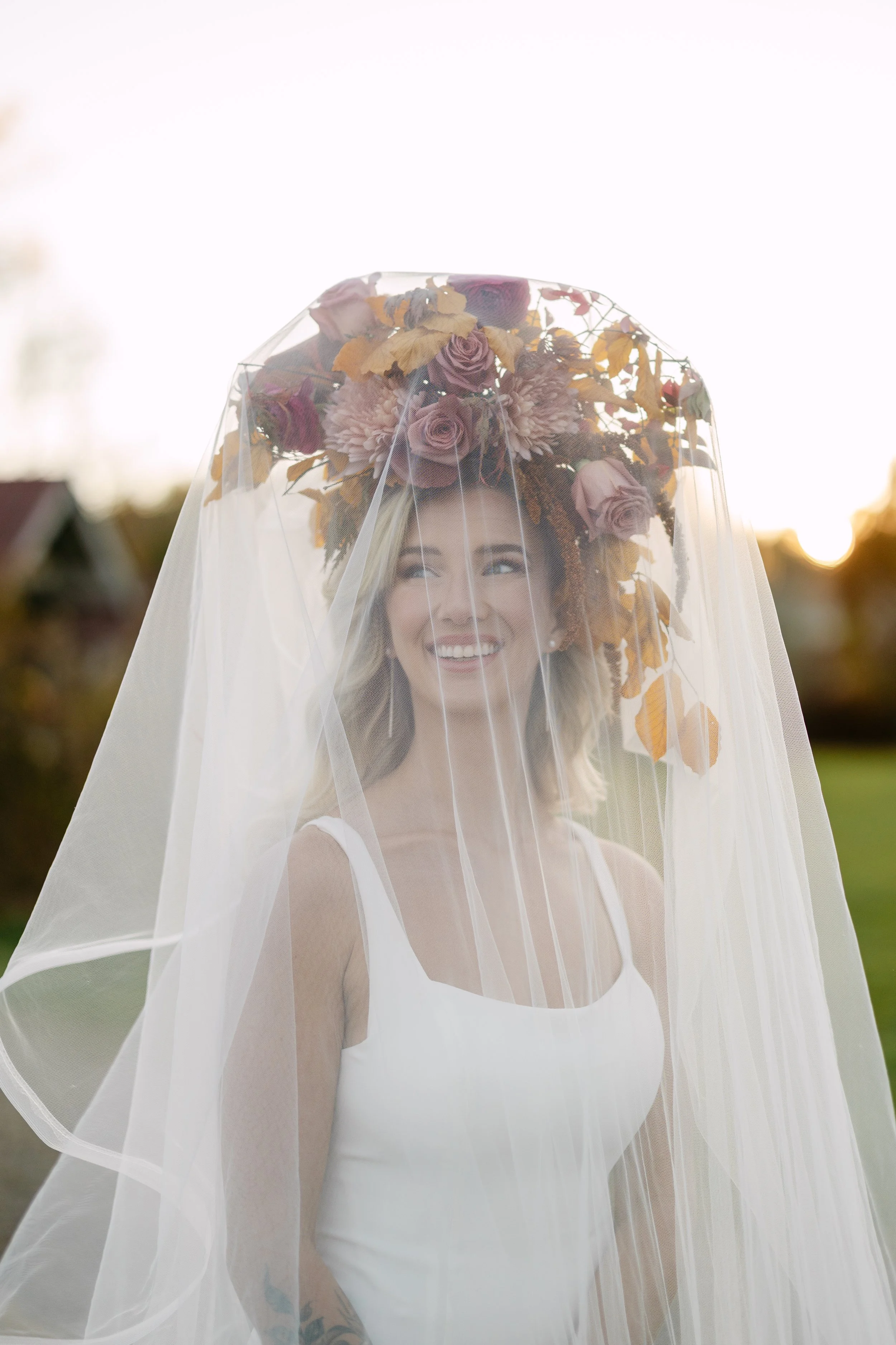
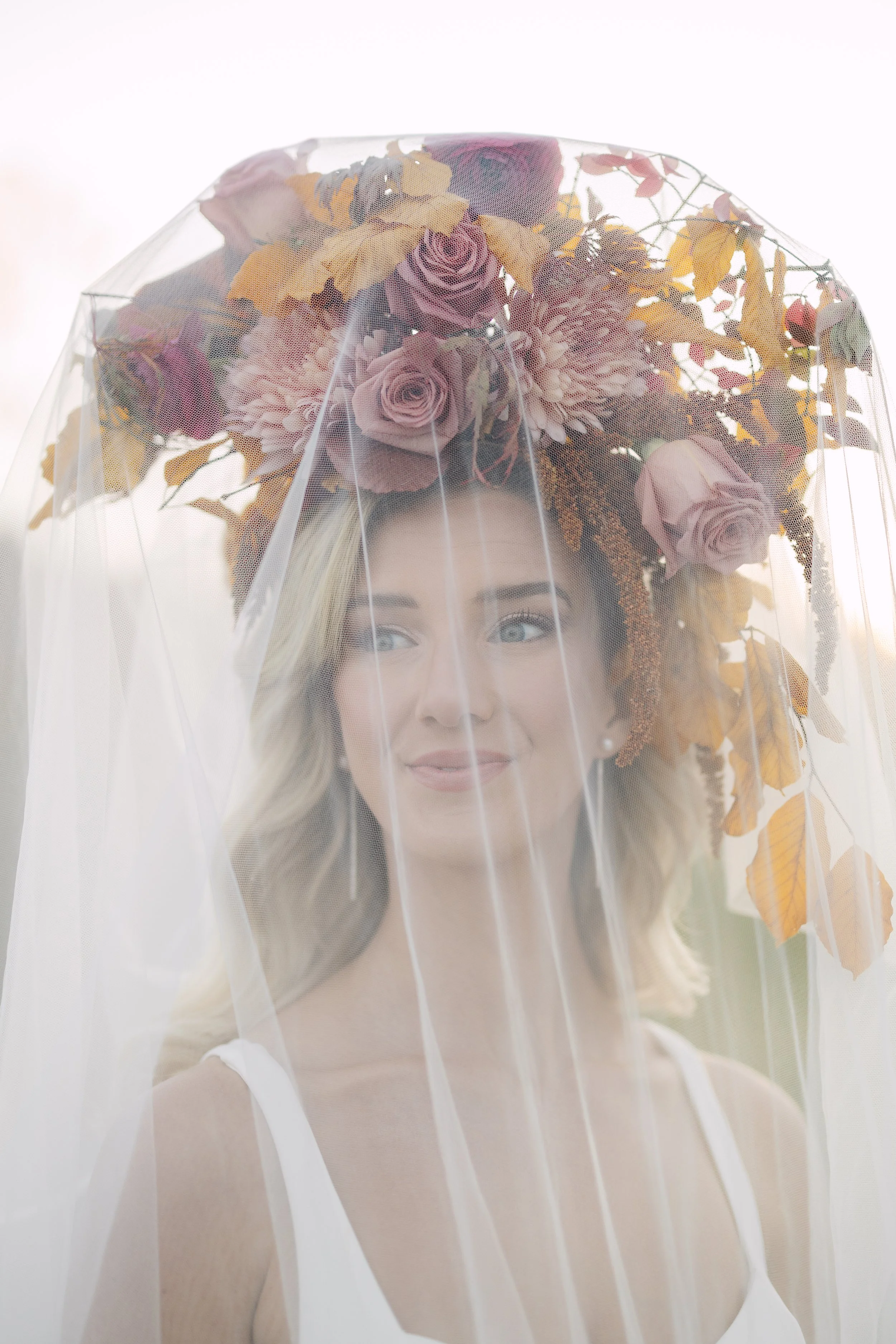
The Flowers
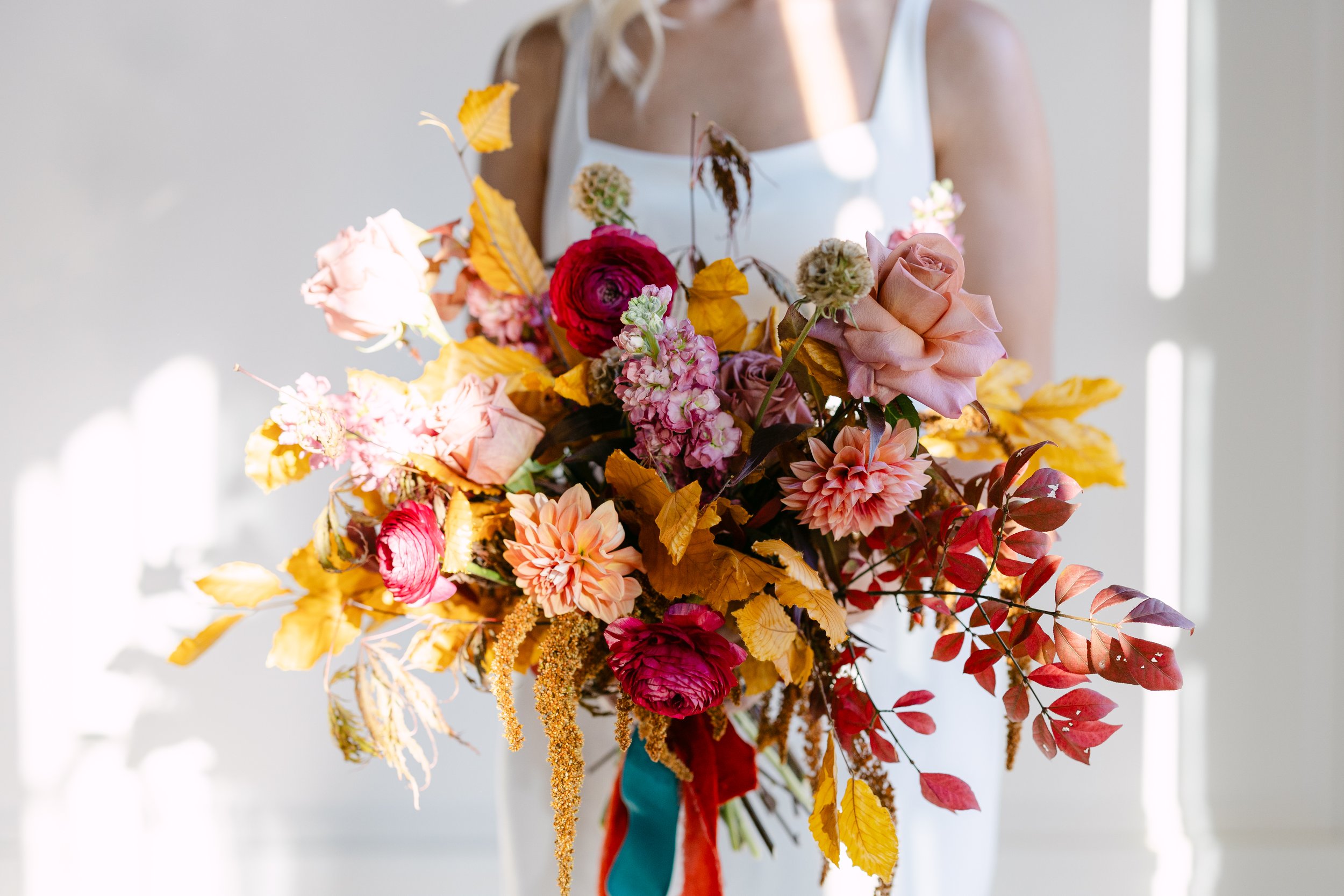
Every stem in this shoot was chosen with the palette and the story in mind. Barista roses in their deep, terracotta rose. Blush Linette Cremon chrysanthemums, layered and generous. Dahlias and ranunculus for movement and softness. Solidago threading through like little sparks of gold. Smoke bush adding its hazy, atmospheric depth. And preserved beech arriving in three tones: bright gold, warm terracotta, and deep burgundy.
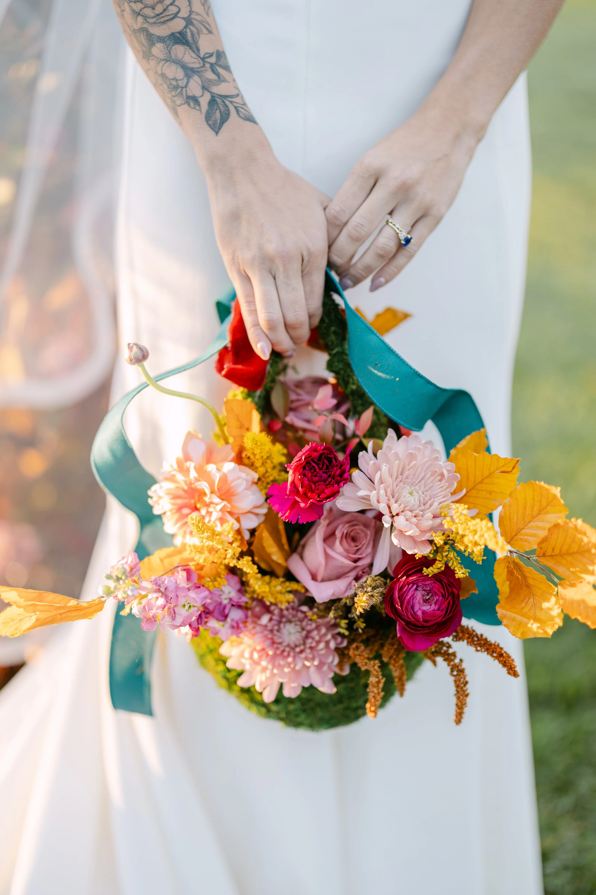
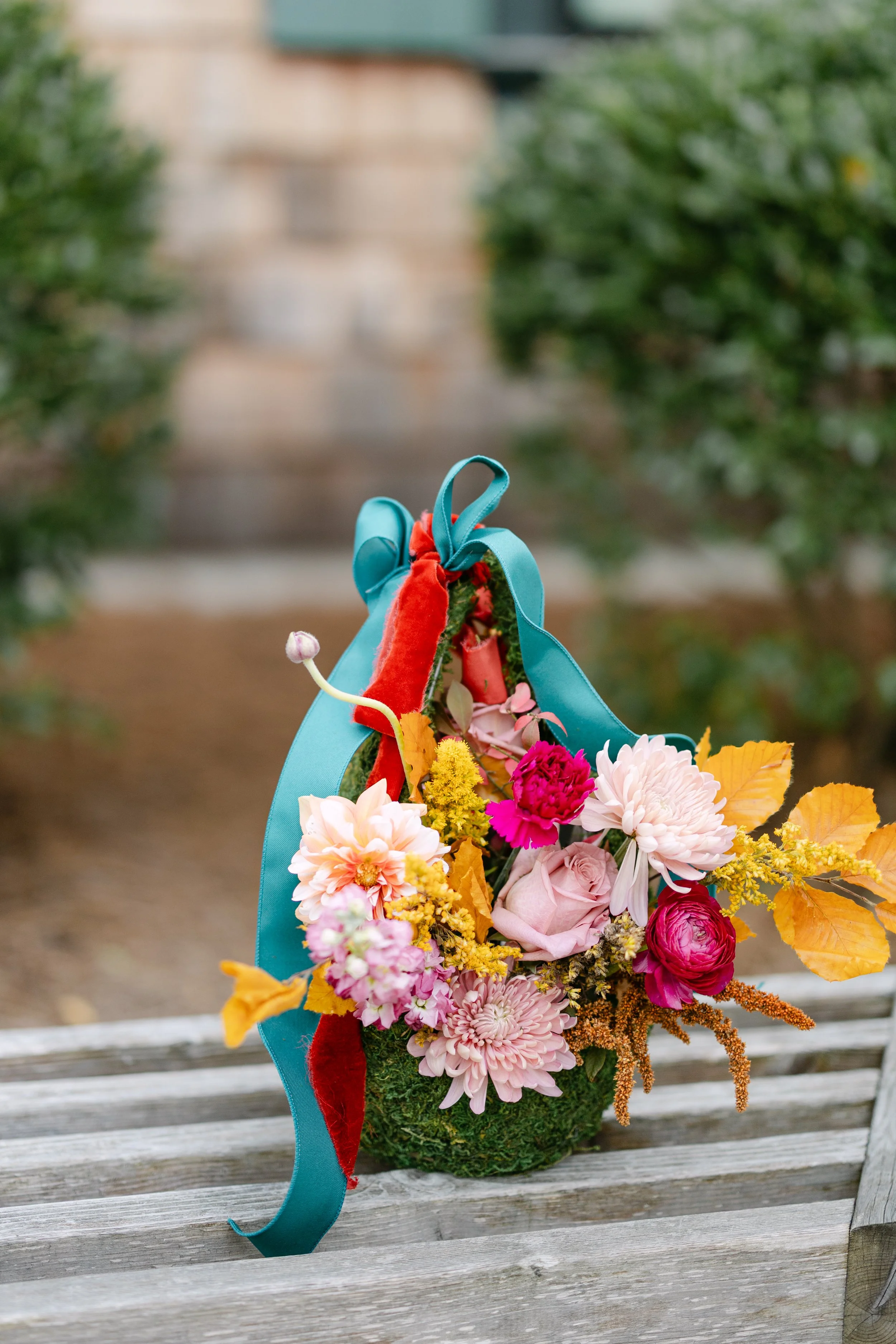
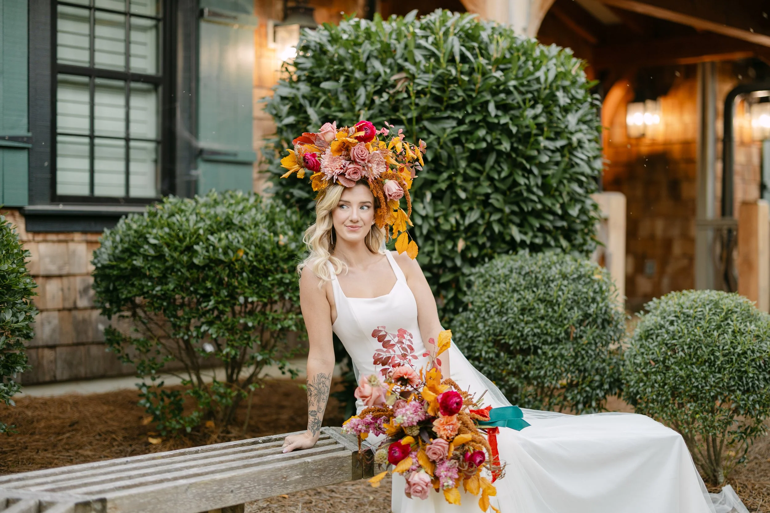
Beyond the Bouquet
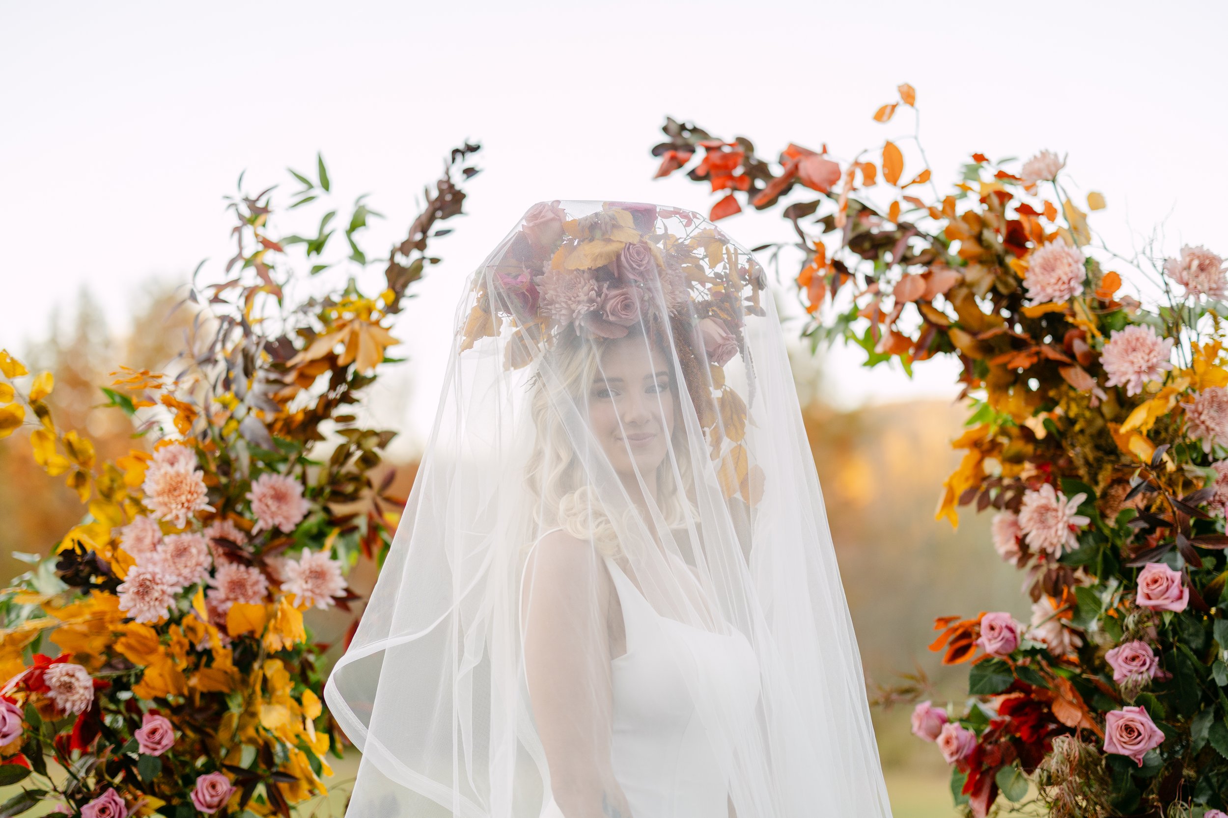
Your personal flowers are an extension of your fantasy — and I want you to know that we are not bound by what’s expected.
A headpiece that feels like it bloomed there overnight. A flower purse so considered and personal it becomes something you keep long after the petals fade. A flower lapel or pocket bout that is its own small work of art rather than a checkbox on a vendor list.
This shoot was a deliberate invitation to dream bigger about what personal flowers can be. Not just a bouquet and a bout. Something adventurous. Something whimsical. Something that could only ever belong to you.
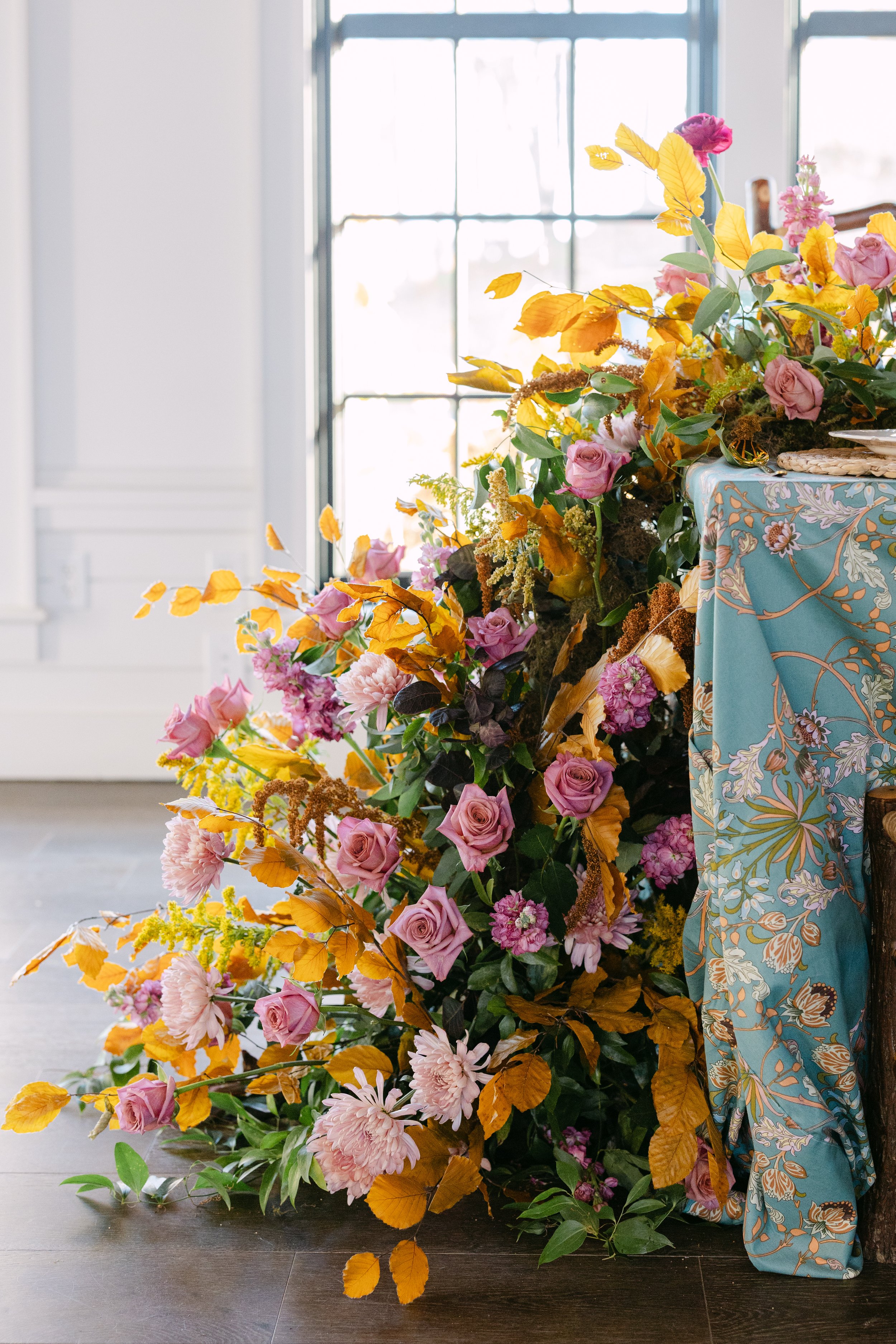
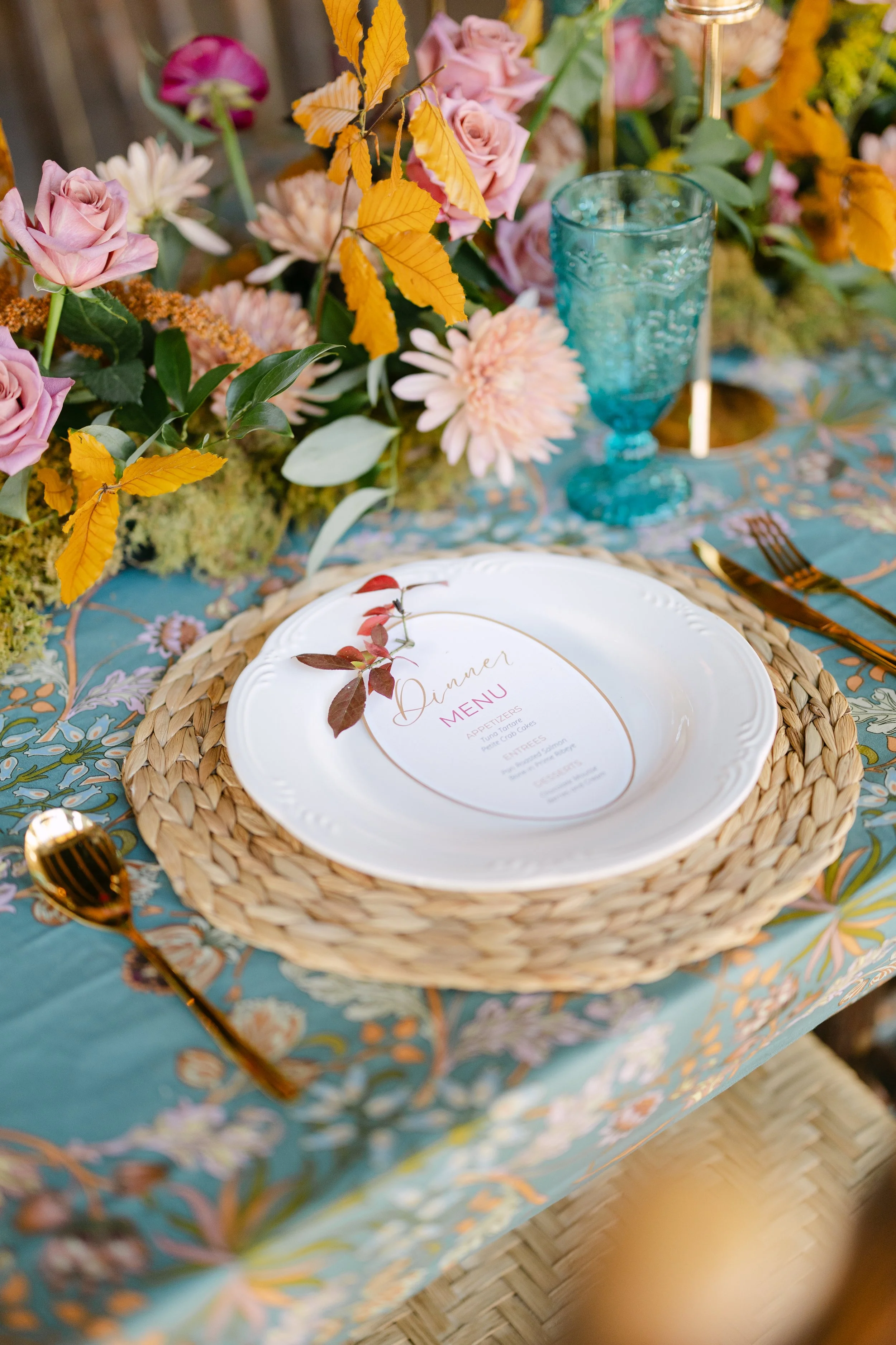
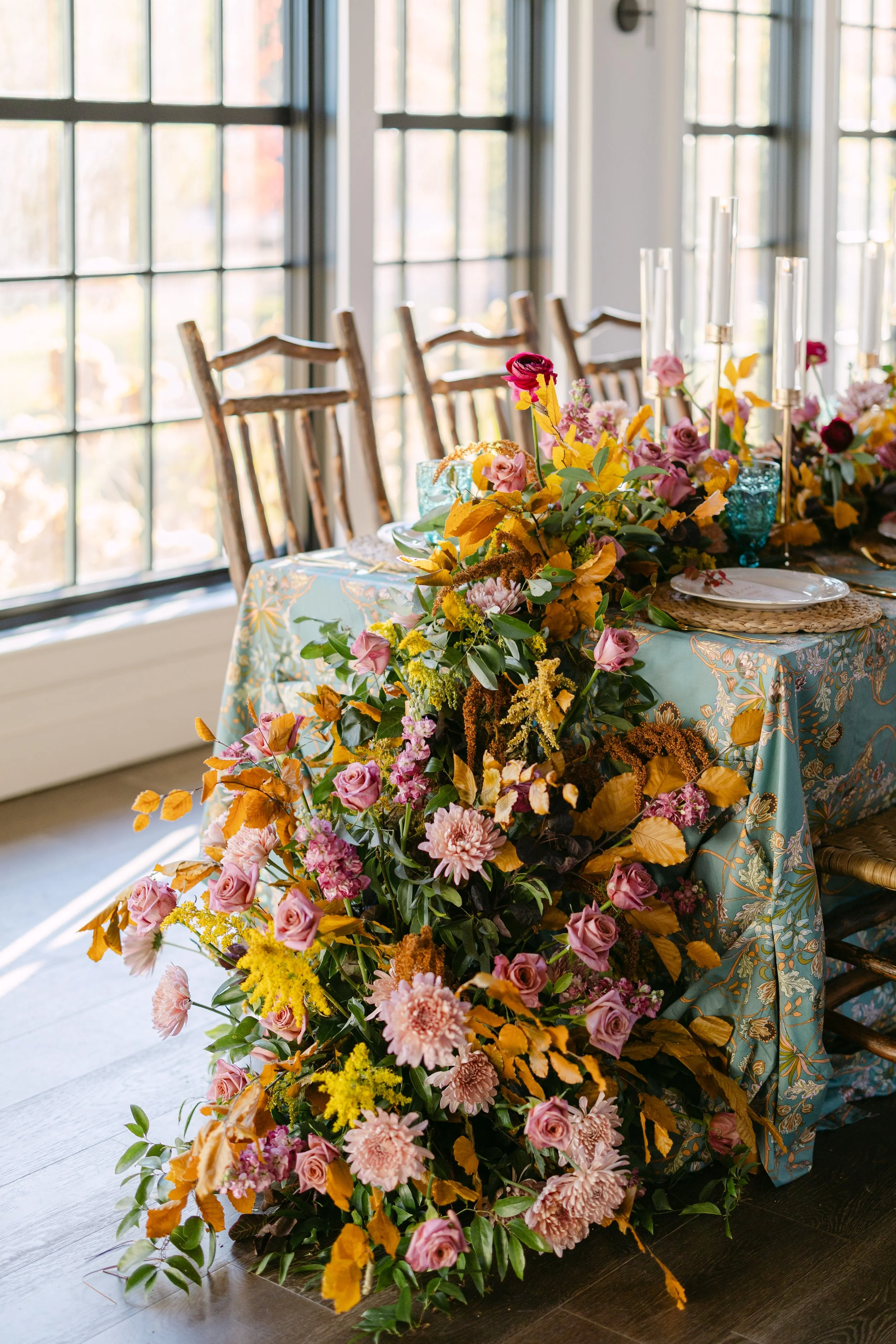
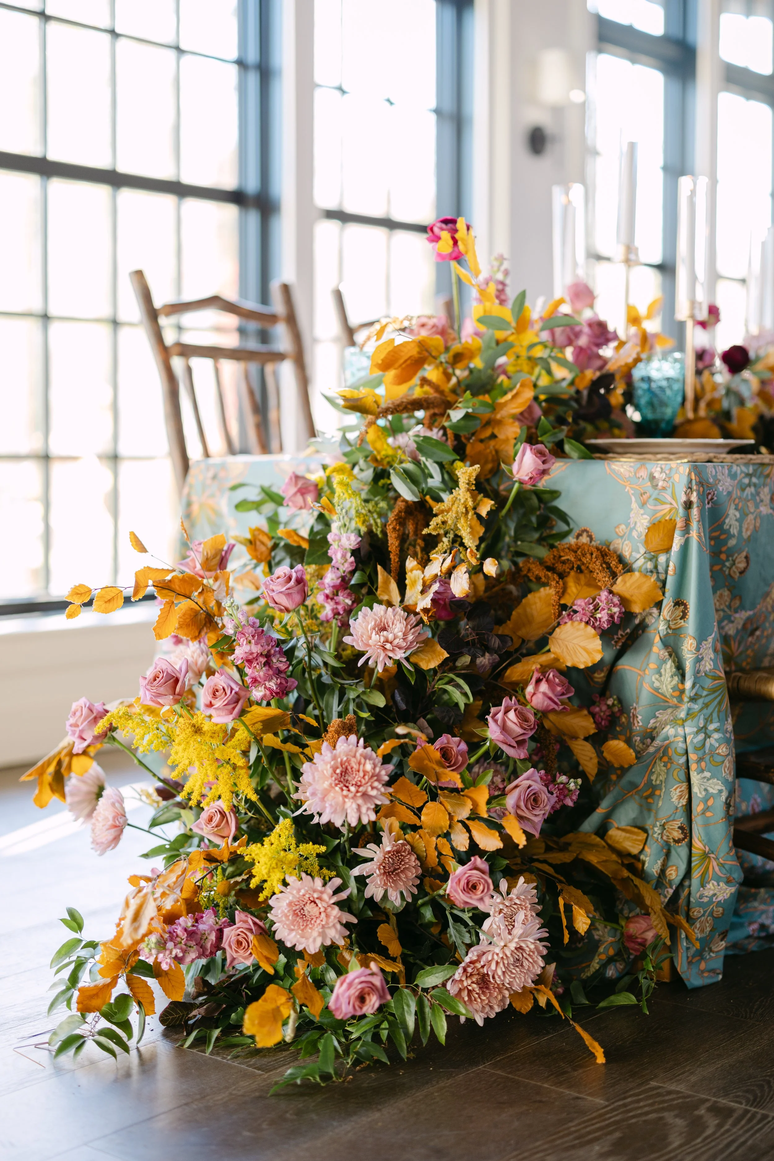
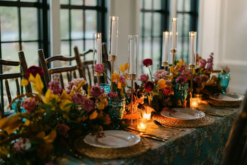
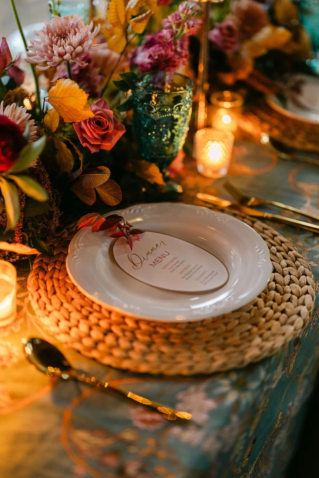
The Tablescape
The table was set entirely with my own rental collection: golden flameless candles, colored vintage goblets, gold flatware, chargers, and napkins. The tablecloth was a custom-chosen pattern — a William Morris-inspired teal botanical print that became the visual anchor for the entire color story. I also designed the menu cards.
The centerpiece was a table meadow — candles, trailing blooms, and texture at every level — finished with a dramatic table cascade that spilled downward like the mountain had grown through the linen.
With Gratitude
This shoot took place right here in Cashiers, NC at the Village Green — a setting that felt perfectly suited to the layered, mountain-rooted aesthetic I was building. It was brought to life with the talent of photographer Darrell Cassell, the grace of model Gabbie Ball, and the support of my mentor florist Brit Cubero of Petal and Fern. All floral design concepts, color direction, styling, and creative vision are my own — I am grateful to each of them for helping me execute it so beautifully.
Dreaming of florals designed from your story? I’d love to hear it.
→ Get in touch at retrowhims.com/get-in-touch